Journey to the End of Colour: Books and Prints
from 06 JUL 2013 to 03 NOV 2013
Nothing is whiter than the memory of white. Yasujiro Ozu
In the history of art making, colour has traditionally been used to accentuate the representation of subjects. The present exhibition, ‘Journey to the End of Colour’, reveals the role of colour in the service of an idea. The visual perception of a colour having many options, even without any figurative image, colour as such can create a large spectrum of evocations; likewise, word compositions printed in black can produce the mental image of a specific colour. Commonly accepted is that blue stands for sky, black for night, red for love or violence. Blue can also stand for the sea, even if we know that the sea can look grey or green. And yellow can stand for the sun, even if we know that the sun can look white or orange. Sometimes colours are not only linked to a mental image, but also to an artist, like blue to Yves Klein, black to Ad Reinhardt, white to Piero Manzoni, gold to James Lee Byars and yellow to… Vincent van Gogh?
The aim of this exhibition is to guide the viewer through a colourful labyrinthine universe and to instigate his/her own interpretations. On display will be artists’ publications dating mostly from the 1960s and 1970s, a period when conceptual art and visual and concrete poetry were taking central stage in the global art scene. They range from all white, all black, or monochrome to polychrome pieces; from the arbitrarily coloured, to pieces whose specific colours denote a precise notion.
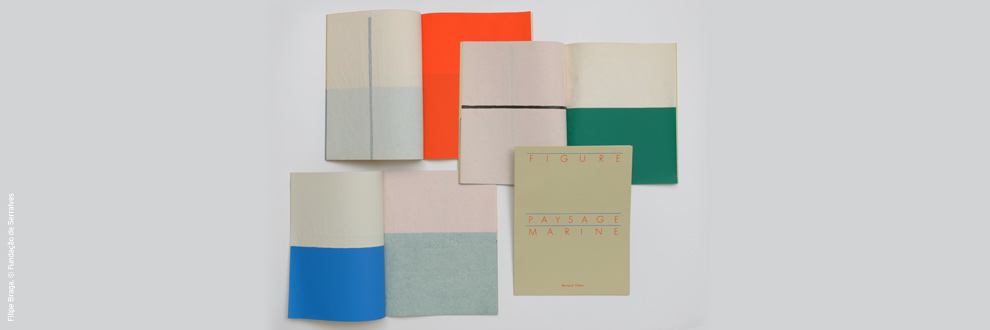
In Paysage Figure Marine (1988) Bernard Villers plays with the traditional forms of paintings in combination with three colours. The high red shape stands for figure, the horizontal blue one for marine and the intermediate green shape for landscape. In Lourdes Castro’s Furrows (1974), a series of seven silkscreens featuring seven identical silhouettes in different colours on different backgrounds, it is not the silhouette but rather the play of colours that dominates the work.
In his book and series of prints, Colours (1983/94), Heinz Gappmayr confronts five coloured sheets with five white sheets where the name of each colour is printed. His book Raum (1977) contains only white pages to evoke space, in this case very prosaically the space between the cover and back cover of the book.
In Passage: Essai sur la couleur (1972), Daniel Buren works on the saturation of colour in a large seven part publication. Although obtained by overprinting identical colours, the progressive darkening is different in each volume.Ernst Caramelle, Anne Deguelle and Sara MacKillop produce books and prints where forms and nuances in colour are obtained by exposure to the sun.
The examples illustrate that the use of colour and the inventive reconfiguration of the conventional format of publications are as infinite as the painter's palette. They also reveal that all colours have different significations according to the historical and cultural context. Many of us associate the colour red in Russia with communism. But in the Russian language red means "beautiful”. Therefore Moscow’s Red Square is in fact Moscow’s beautiful square. It is evident that different approaches to colour can evoke disparate and even contradictory effects. How many words do we have to name a colour? How many words do we need to name all their combinations?
Text by Guy Schraenen, edited by Maria Ramos
Loans: ASPC and Fond Heinz Gappmayr / Research Centre for Artists' Publications, Weserburg, Bremen
Featured artists: Robert Barry, Daniel Buren, James Lee Byars, Lourdes Castro, Carlos Cruz-Diez, Anne Deguelle, Heinz Gappmayr, Michael Gibbs, Paul Graham, Ellsworth Kelly, Yves Klein, Robert Lax, Sherrie Levine, Sara Mackillop, Pierre-Lin Renié, Gerhard Richter, Paul Sharits, Ettore Spalletti, Endre Tót, Morgane Tschiember, Uriburu, Jiri Valoch, Philippe Van Snick, , Bernard Villers, Herman de Vries, Emmett Williams
The exhibition is curated by Guy Schraenen, Advisor for the Serralves Collection of Artist Books and Publications.
In the history of art making, colour has traditionally been used to accentuate the representation of subjects. The present exhibition, ‘Journey to the End of Colour’, reveals the role of colour in the service of an idea. The visual perception of a colour having many options, even without any figurative image, colour as such can create a large spectrum of evocations; likewise, word compositions printed in black can produce the mental image of a specific colour. Commonly accepted is that blue stands for sky, black for night, red for love or violence. Blue can also stand for the sea, even if we know that the sea can look grey or green. And yellow can stand for the sun, even if we know that the sun can look white or orange. Sometimes colours are not only linked to a mental image, but also to an artist, like blue to Yves Klein, black to Ad Reinhardt, white to Piero Manzoni, gold to James Lee Byars and yellow to… Vincent van Gogh?
The aim of this exhibition is to guide the viewer through a colourful labyrinthine universe and to instigate his/her own interpretations. On display will be artists’ publications dating mostly from the 1960s and 1970s, a period when conceptual art and visual and concrete poetry were taking central stage in the global art scene. They range from all white, all black, or monochrome to polychrome pieces; from the arbitrarily coloured, to pieces whose specific colours denote a precise notion.
In Paysage Figure Marine (1988) Bernard Villers plays with the traditional forms of paintings in combination with three colours. The high red shape stands for figure, the horizontal blue one for marine and the intermediate green shape for landscape. In Lourdes Castro’s Furrows (1974), a series of seven silkscreens featuring seven identical silhouettes in different colours on different backgrounds, it is not the silhouette but rather the play of colours that dominates the work.
In his book and series of prints, Colours (1983/94), Heinz Gappmayr confronts five coloured sheets with five white sheets where the name of each colour is printed. His book Raum (1977) contains only white pages to evoke space, in this case very prosaically the space between the cover and back cover of the book.
In Passage: Essai sur la couleur (1972), Daniel Buren works on the saturation of colour in a large seven part publication. Although obtained by overprinting identical colours, the progressive darkening is different in each volume.Ernst Caramelle, Anne Deguelle and Sara MacKillop produce books and prints where forms and nuances in colour are obtained by exposure to the sun.
The examples illustrate that the use of colour and the inventive reconfiguration of the conventional format of publications are as infinite as the painter's palette. They also reveal that all colours have different significations according to the historical and cultural context. Many of us associate the colour red in Russia with communism. But in the Russian language red means "beautiful”. Therefore Moscow’s Red Square is in fact Moscow’s beautiful square. It is evident that different approaches to colour can evoke disparate and even contradictory effects. How many words do we have to name a colour? How many words do we need to name all their combinations?
Text by Guy Schraenen, edited by Maria Ramos
Loans: ASPC and Fond Heinz Gappmayr / Research Centre for Artists' Publications, Weserburg, Bremen
Featured artists: Robert Barry, Daniel Buren, James Lee Byars, Lourdes Castro, Carlos Cruz-Diez, Anne Deguelle, Heinz Gappmayr, Michael Gibbs, Paul Graham, Ellsworth Kelly, Yves Klein, Robert Lax, Sherrie Levine, Sara Mackillop, Pierre-Lin Renié, Gerhard Richter, Paul Sharits, Ettore Spalletti, Endre Tót, Morgane Tschiember, Uriburu, Jiri Valoch, Philippe Van Snick, , Bernard Villers, Herman de Vries, Emmett Williams
The exhibition is curated by Guy Schraenen, Advisor for the Serralves Collection of Artist Books and Publications.